In this article, you will learn about the concept of simplicity in color and how to choose a minimalist palette. By understanding the principles of minimalism and color theory, you will be able to create a clean and sophisticated look in your designs. Whether you are a graphic designer, an interior decorator, or simply someone looking to create a calm and balanced space, this article will provide you with the knowledge and inspiration to create a minimalist color palette that speaks volumes with its simplicity.
Understanding Minimalist Design
What is Minimalist Design?
Minimalist design is a style that embraces simplicity and functionality. It focuses on stripping away unnecessary elements and clutter to create clean and uncluttered spaces. Minimalist design is characterized by clean lines, open spaces, and a limited color palette. The goal is to create an environment that promotes calmness, clarity, and serenity.
Key Principles of Minimalist Design
There are several key principles that guide minimalist design:
-
Simplicity: Minimalist design is all about simplicity. It aims to eliminate excess and focus on the essentials. The principle of simplicity is reflected in the use of clean lines, uncluttered spaces, and minimal decoration.
-
Functionality: Minimalist design prioritizes functionality. Furniture and objects are chosen for their practicality and utility. Every item has a purpose and serves a function within the space.
-
Balance: Minimalist design seeks balance and harmony. It is important to create a sense of equilibrium by distributing elements evenly throughout the space. Balance can be achieved through the use of symmetry, proportion, and scale.
-
Natural Light: Minimalist design embraces natural light. It maximizes the use of windows and open spaces to flood the interior with sunlight. Natural light creates a sense of openness and vitality in minimalist spaces.
-
Quality over Quantity: In minimalist design, it is better to invest in a few high-quality pieces than to fill the space with cheap and disposable items. Quality craftsmanship and materials are essential to create a timeless and durable aesthetic.
Importance of a Minimalist Color Palette
Effects of Colors on Mood
Colors have a powerful impact on our emotions and mood. They can evoke different feelings and create different atmospheres within a space. In minimalist design, the color palette plays a crucial role in setting the tone and ambiance of the room.
Creating a Harmonious Design
A minimalist color palette is essential for creating a harmonious design. By limiting the number of colors used, the design remains cohesive and visually pleasing. A harmonious color scheme helps to create a sense of tranquility and simplicity in the space.
This image is property of i.etsystatic.com.
Choosing Colors for a Minimalist Palette
Consideration of Neutrals
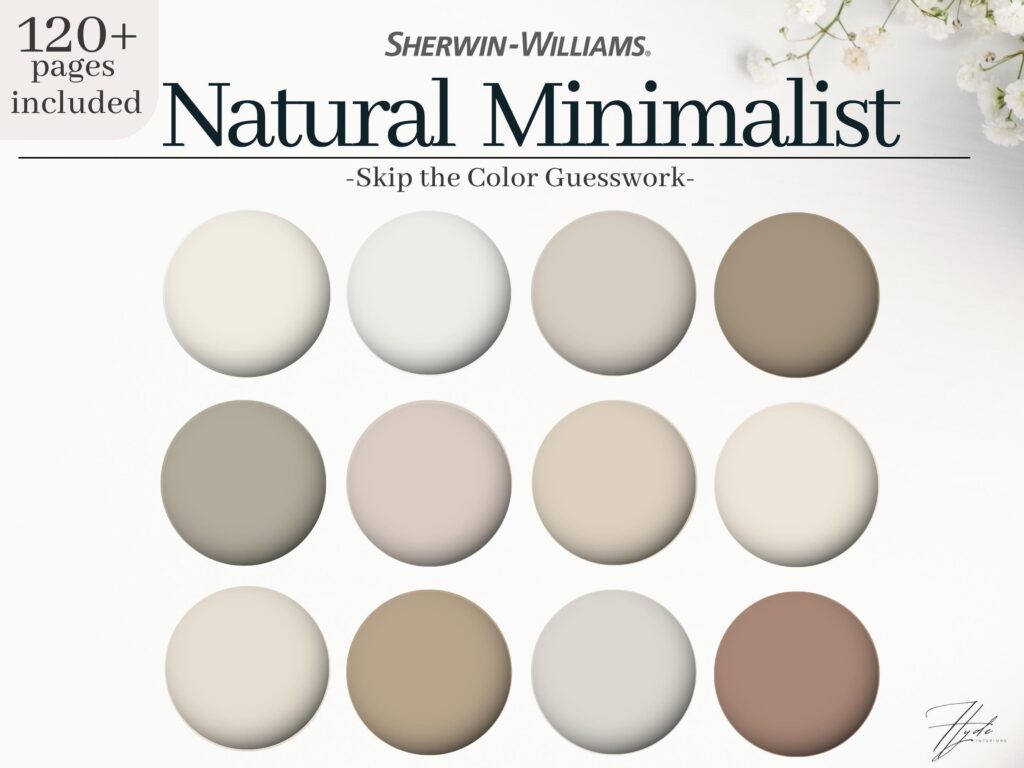
Neutrals are the foundation of a minimalist color palette. They provide a calm and clean backdrop for the design. Shades of white, gray, and beige are commonly used in minimalist spaces. These colors create a sense of serenity and allow other elements in the room to stand out.
Exploring Monochromatic Schemes
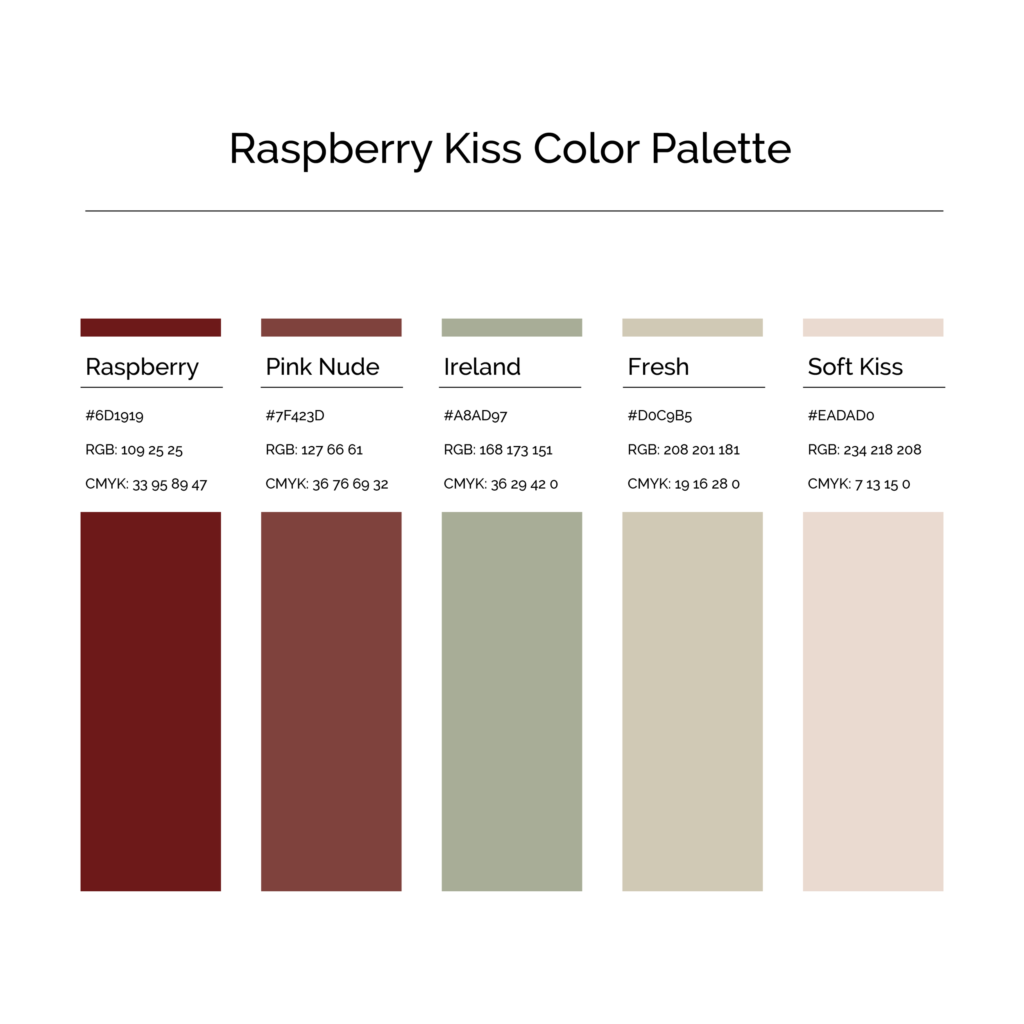
Monochromatic schemes are another option for a minimalist palette. They involve using different shades and tints of a single color. This creates a visually cohesive and soothing design. Monochromatic schemes work particularly well with cool colors such as blues and greens.
Utilizing Accents and Pops of Color
Minimalist design also allows for the use of accents and pops of color. These can add visual interest and create focal points within the space. Accents can be achieved through the use of bold and vibrant colors in small doses. This adds a touch of personality and liveliness to the minimalist design.
Neutral Colors for a Minimalist Palette
Elegant Whites
White is the epitome of simplicity and cleanliness. It creates a sense of purity and spaciousness in a room. White also reflects light, making a space feel bright and airy. By using different shades and textures of white, you can add depth and dimension to the design.
Sophisticated Grays
Gray is a versatile color that can create a sense of sophistication and elegance in a minimalist space. It can range from light shades of silver to deep charcoal hues. Gray serves as a neutral base that pairs well with a variety of other colors and materials.
Warm Beiges and Tans
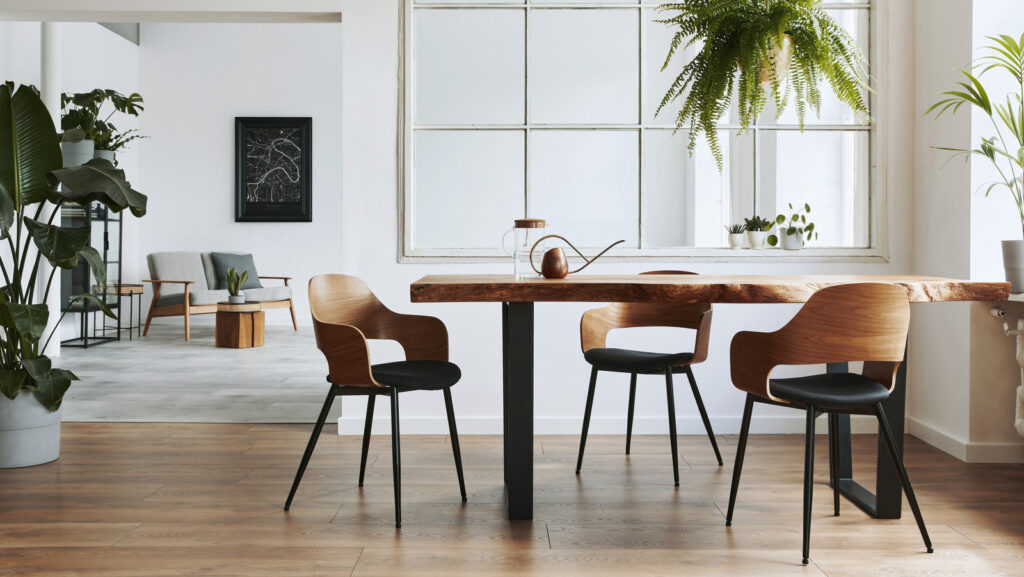
Beiges and tans add warmth and coziness to a minimalist palette. These earthy tones create a sense of comfort and serenity. Beiges and tans work well with natural materials such as wood and stone, enhancing the organic and harmonious feel of minimalist design.
This image is property of qph.cf2.quoracdn.net.
Monochromatic Schemes for a Minimalist Palette
Stylish Black and White
Black and white is a classic and timeless color combination. It creates a bold and striking contrast in a minimalist design. The starkness of black and white adds drama and depth to the space, while still maintaining a clean and simple aesthetic.
Soothing Shades of Blue
Blue is a calming and soothing color that promotes relaxation and tranquility. Light shades of blue work particularly well in minimalist design, as they create a sense of serenity. Blue can be incorporated through painted walls, furniture, or accessories.
Calming Earth Tones
Earth tones such as browns and greens evoke a sense of nature and bring a soothing and grounding element to a minimalist palette. These colors create a connection to the outdoors and add warmth and depth to the space.
Accents and Pops of Color in a Minimalist Palette
Adding Vibrant Reds
Red is a bold and energetic color that can add a vibrant touch to a minimalist design. By using red as an accent color, you can create a focal point and bring a sense of liveliness to the space. Red can be incorporated through furniture, artwork, or accessories.
Invigorating Yellows
Yellow is a cheerful and uplifting color that can bring a sense of energy and positivity to a minimalist palette. It adds warmth and brightness to the space, creating a welcoming and inviting atmosphere. Yellow can be incorporated through textiles, cushions, or decorative accents.
Refreshing Greens
Green is a refreshing and calming color that brings a sense of nature and tranquility to a minimalist design. It symbolizes growth and renewal. Green can be introduced through plants, artwork, or accent furniture. It adds a touch of serenity and vibrancy to the space.
This image is property of www.housedigest.com.
Creating a Harmonious Minimalist Design
Balancing Light and Dark Tones
In a minimalist design, it is important to balance light and dark tones. This creates a sense of contrast and depth in the space. Light tones can be used to make the room feel bright and open, while dark tones add drama and visual interest. Finding the right balance between light and dark tones is crucial for creating a harmonious design.
Contrasting Textures and Finishes
Texture adds another layer of interest to a minimalist design. By contrasting textures and finishes, you create visual variety and depth in the space. Smooth and sleek surfaces can be paired with rough and matte textures to create balance and intrigue.
Emphasizing Line and Shape
Minimalist design relies heavily on clean lines and geometric shapes. Emphasizing line and shape in the design creates visual harmony and cohesion. Straight lines and sharp angles create a sense of order and simplicity, while curves and organic shapes add softness and elegance.
Maximizing Impact with Minimalist Color
Emotional Impact of Minimalist Color
Colors have a profound impact on our emotions and can evoke different feelings within a space. By carefully selecting colors for a minimalist palette, you can create a specific emotional impact. Whether you want to create a calming and serene environment or a vibrant and energetic space, the right colors can help you achieve the desired emotional effect.
Enhancing Visual Focus
A minimalist color palette enhances visual focus within a space. By limiting the number of colors used, the eye is drawn to specific elements and architectural features. This creates a sense of simplicity and clarity in the design. It allows the eye to rest and appreciate the beauty of each individual item.
Creating a Timeless Aesthetic
Minimalist design is known for its timeless and enduring qualities. By choosing a minimalist color palette, you can ensure that your design remains relevant and stylish for years to come. The simplicity and restraint of a minimalist color scheme transcend trends and create a timeless aesthetic.
This image is property of images.squarespace-cdn.com.
Choosing Minimalist Colors for Different Spaces
Minimalist Palette for Living Rooms
In the living room, it is important to create a welcoming and comfortable atmosphere. Soft neutrals such as whites, grays, and beiges work well as a base color palette. Accents of warm earth tones or pops of vibrant colors can be added through furniture or accessories to create visual interest and personality.
Minimalist Palette for Bedrooms
The bedroom should be a serene and relaxing sanctuary. Light and airy colors such as whites, pastels, and light blues work well in a minimalist bedroom. These colors create a sense of tranquility and promote restful sleep. Texture can be added through bedding and soft furnishings to add depth and coziness.
Minimalist Palette for Offices
In an office or workspace, it is important to create a productive and focused environment. Neutral colors such as whites, grays, and beiges provide a clean and uncluttered backdrop. Accents of energizing colors such as yellows or greens can be used to promote creativity and concentration.
Conclusion
Simplicity in color is key to achieving a minimalist palette. By carefully selecting and coordinating colors, you can create a harmonious and visually pleasing design. Keep in mind the principles of simplicity, functionality, and balance when choosing colors for your minimalist space. With the right color palette, you can create a serene, timeless, and impactful environment.
This image is property of thecorebasics.com.
